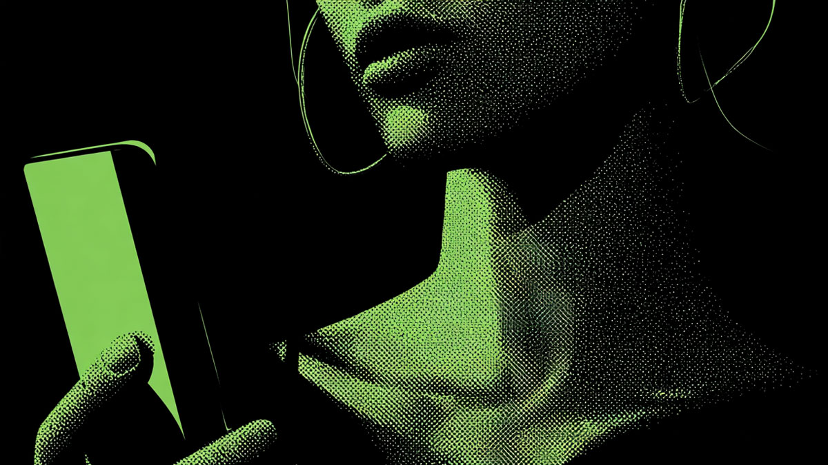
Designing for dark mode is more than flipping the switch
Dark mode isn’t a trend — it’s an expectation. From iOS to Android to web apps, users now expect UX/UI design that adapts to their preferences. But great dark mode design isn’t just a color inversion. It’s about contrast, legibility, mood, and usability. Done wrong, dark mode feels like an afterthought. Done right, it’s sleek, accessible, and user-first.
What makes dark mode different?
Dark mode design needs to rethink every aspect of your interface — from text readability to brand color shifts. The ambient light is different. So are user expectations. Designing dark mode well means balancing aesthetics with usability under low-light conditions.
Best practices for designing dark mode interfaces
Here’s how to go beyond the basics and build a dark mode that feels intentional, polished, and user-friendly:
- Don’t use pure black (#000000): True black creates harsh contrast. Use dark grays (like #121212 or #1E1E1E) to soften the experience and reduce eye strain.
- Adjust brand colors for dark backgrounds: Saturated hues can look neon or muddy. Consider tweaking tones and lightness for better harmony.
- Rethink shadows and elevation: Light shadows don’t work on dark backgrounds. Use soft glows or subtle light-colored shadows to create depth.
- Test accessibility contrast: Ensure at least 4.5:1 contrast ratio for body text. WCAG compliance matters even more in low-light settings.
- Handle images and illustrations carefully: Some assets may need adjustment or alternate versions to avoid looking washed out or too bright.
- Use consistent lighting logic: Think of your interface like a physical space. Use light-on-dark cues that feel directional and natural.
UI patterns that need extra attention in dark mode
Not all components translate well. Watch out for these common pitfalls:
- Form fields: Make sure input backgrounds, borders, and focus states are clearly visible and intuitive.
- Dividers and separators: On dark backgrounds, low-contrast lines can disappear. Use subtle light strokes or spacing instead.
- Hover states and interactivity: Color cues behave differently. Add contrast through lightness changes, not just hue shifts.
Don’t forget system-level considerations
Dark mode should follow OS preferences and offer manual toggles. Respect user choice — and test your design in both modes across devices. Also, if your product spans web and mobile, ensure visual consistency across platforms.
Dark mode should feel designed — not reversed
The best dark modes aren’t just lighter UIs turned upside down. They’re purpose-built environments with their own rules and feel. When you treat dark mode as its own design problem — not just an alternate palette — your product feels smarter, sharper, and more human.
Frequently Asked Questions
Why not use pure black in dark mode?
Pure black creates excessive contrast that can strain the eyes, especially in low-light conditions. Dark grays provide a more comfortable, modern look.
Should brand colors change in dark mode?
Yes — colors may need tweaking for contrast and harmony. Bright or saturated brand colors can appear too loud or unreadable on dark backgrounds.
Is dark mode better for accessibility?
Not always. Some users prefer light mode due to visual impairments. Dark mode should be an option, not a default, and must meet contrast guidelines to be usable.
Glossary Terms
This site uses affiliate links, which means we may earn a commission at no extra cost to you.


