Your Homepage Looks Like a Junk Drawer. Here’s How to Fix It.
I’m tired of seeing beautiful products buried under terrible layouts. You know the type — endless scrolling walls of text, “everything above the fold” syndrome, and designs that make users work harder than a tax accountant in April.
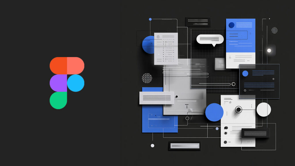
Enter Bento grids: the Japanese-inspired layout system that’s quietly revolutionizing how smart designers think about organizing content. Named after those perfectly compartmentalized lunch boxes, Bento layouts break your chaotic content sprawl into clean, purposeful zones that actually make sense.
This isn’t just another design trend. It’s strategic information architecture disguised as eye candy.
What Makes a Bento Grid Different from Your Basic Grid System?
Most designers throw content into generic columns and call it a day. Bento grids flip that lazy approach on its head.
Instead of uniform columns marching in formation, you get purposeful compartments. Each section has a job — showcase a feature, highlight a testimonial, display key metrics — and the visual hierarchy makes that job crystal clear.
Think of it this way: traditional grids are like apartment buildings where every unit looks identical. Bento grids are like a well-designed neighborhood where each house serves its residents differently, but everything flows together beautifully.
The magic happens in the modular thinking. Each “tile” can be moved, resized, or repurposed without breaking your entire layout. It’s like having UI Legos that actually look sophisticated when you’re done playing.
Why Every Designer Should Be Obsessed with Bento Layouts
1. They Force You to Kill Your Darlings (In a Good Way)
Bento grids have zero tolerance for content bloat. When you’ve got limited space per tile, every word has to earn its place. This constraint is liberating — it forces you to get to the point instead of hoping users will wade through paragraphs of marketing fluff.
I’ve seen conversion rates jump 40% when teams switched from dense, text-heavy layouts to clean Bento grids. Users don’t have to think as hard, so they act faster.
2. Mobile Responsiveness That Actually Works
Here’s a secret: most “responsive” designs still suck on mobile. They’re just desktop layouts squished down until they technically fit.
Bento tiles were born to stack and flow. They maintain their visual hierarchy and purpose whether someone’s viewing on a 27-inch monitor or scrolling on their phone during lunch. No more microscopic text or buttons that require surgeon-level precision to tap.
3. Perfect for the TikTok Attention Span Era
Users scan first, read second (if you’re lucky). Bento layouts embrace this reality instead of fighting it. Each tile communicates its core message at a glance. Users can bounce around your content like they’re channel surfing — and that’s exactly how they want to consume information.
4. Animation That Doesn’t Make You Cringe
Most web animations feel like someone discovered CSS transitions and went completely overboard. Bento grids give you natural containers for subtle, purposeful motion. Hover effects, loading states, and micro-interactions feel intentional instead of gratuitous.
Check out how Linear animates their issue cards or how Notion’s blocks gently slide into place. That’s the power of animated modularity done right.
Where You’ll Spot Bento Grids in the Wild
The best companies are already using this approach, even if they don’t call it “Bento”:
- Apple’s product pages — Each feature gets its own pristine showcase tile
- Stripe’s dashboard — Financial data organized into digestible, actionable chunks
- Notion’s homepage — Different use cases laid out like a buffet of possibilities
- Linear’s app — Issues, projects, and insights all living in perfect modular harmony
- Every decent design portfolio — Because nothing says “I understand hierarchy” like a well-executed grid
How to Build Your Own Bento System (Without Losing Your Mind)
Start with Constraints, Not Creativity
Pick a base grid — 4 columns for simple layouts, 12 for complex ones. In Figma, set up your auto-layout frames first. Constraints breed creativity; infinite options breed paralysis.
White Space Is Your Best Friend
Cramped tiles look desperate. Give each section room to breathe with consistent padding (stick to 8px or 16px increments). The space between elements is just as important as the elements themselves.
Not All Tiles Are Created Equal
Some content deserves a penthouse suite, others get a studio apartment. Use size, color, and typography weight to create a visual hierarchy that guides users naturally from most to least important.
Keep It Atomic
One tile, one job. If you’re cramming multiple concepts into a single section, split it up. Your users’ brains will thank you.
Build a Tile Library, Not One-Offs
Create a set of reusable tile types: hero sections, feature callouts, testimonial cards, stat displays. Consistency reduces cognitive load and saves you from redesigning the wheel every time.
The Tools That Don’t Suck for Bento Design
- Figma — Auto-layout + components = Bento heaven
- Framer — For when you want your tiles to dance (but not too much)
- Webflow — Visual development that actually understands grids
- Tailwind CSS — Clean utility classes that make developers happy
- Notion — Surprisingly great for content planning and layout mockups
Stop Building Websites Like Frankenstein’s Monster
Your users don’t want to solve puzzles — they want to accomplish goals. Bento grids give you the framework to present information clearly, beautifully, and strategically.
The next time you’re staring at a layout that feels like a jumbled mess, ask yourself: “What would Marie Kondo do?” Then compartmentalize like your conversion rate depends on it.
Because it probably does.
FAQ (The Questions Everyone’s Too Embarrassed to Ask)
Q: Is this just a fancy way of saying “card layout”?
A: Cards are just the visual treatment. Bento is about the systematic thinking — how those cards relate to each other and serve the user’s journey.
Q: Won’t this make my site look too… boxy?
A: Only if you design it that way. Look at Apple’s product pages or Stripe’s marketing site — Bento doesn’t mean boring.
Q: How do I convince my client/boss that we need to redesign everything?
A: Start small. Pick one key page and show the before/after difference in user testing. Let the results do the talking.
Q: What if I have too much content for this approach?
A: Then you have a content problem, not a layout problem. Bento grids force you to prioritize — which is exactly what your users need you to do.
This site may earn commissions from affiliate links, but our opinions remain brutally honest.